

Prima Pasta
Enhancing the ordering experience for students and working professionals, thereby maximizing their time and boosting customer retention for the restaurant, Prima Pasta.
My Role
Client
UX/UI Designer
Prima Pasta
Team
Timeline
Individual Contributor
4 months

BACKGROUND
Prima Pasta, the Restaurant
The COVID-19 pandemic had severe impacts on neighborhood restaurants like Prima Pasta, known for its Italian cuisine. The sudden indoor dining shutdown in March 2020 caught many off guard, leading to a surge in takeout and delivery orders. Despite reopening safely, Prima Pasta struggled with declining customers, prompting my investigation into underlying retention challenges worsened by the pandemic.
My research pinpointed a key factor: The absence of a dedicated app for convenient food orders.
Currently, customers rely on dining in, placing phone orders, or using third-party delivery apps like UberEats and DoorDash.
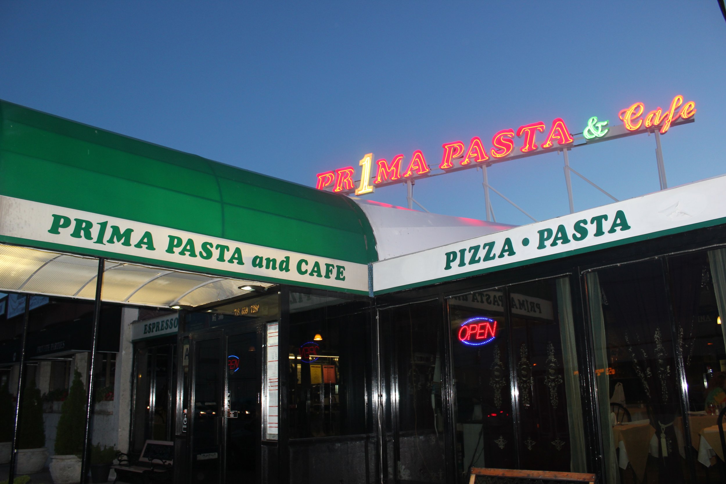
Prima Pasta as seen from outside
The Problem
The absence of a dedicated app for ordering can result in a less seamless, less personalized, and potentially less satisfactory customer experience, impacting customer loyalty and retention. It creates negative experiences for users relating to:
Inconvenience:
Relying solely on phone orders or third-party delivery apps may be less convenient for customers compared to using a dedicated app.
Inaccurate Information:
Third-party apps might not consistently provide accurate information about menu items, prices, and operating hours. Customers may face confusion or frustration when the information they rely on is unreliable.
Communication Challenges:
Direct communication with customers, such as updates, special announcements, or feedback collection, becomes more challenging without a dedicated app.
From a Business Perspective:
Not having a dedicated app can result in reduced control, increased costs, limited access to customer data, and diminished brand visibility.
These factors have the potential to breed customer dissatisfaction, impair the restaurant's reputation, and contribute to a suboptimal customer experience, ultimately leading to a decline in customer retention.
How Can I Solve This?
With the growing trend of takeout and delivery among busy professionals and students, I recognized the need to offer a more personalized and efficient ordering solution.
By creating a dedicated mobile app for Prima Pasta, I aimed to improve the ordering experience and ensure customer loyalty by establishing a direct connection with their customers.
MY PROCESS

MARKET RESEARCH
Why Focus on Takeout?
The COVID-19 pandemic significantly impacted customers’ dining and ordering habits even after restrictions were lifted, with more people preferring to order takeout than before. In fact,

As a result, many restaurants are now investing more resources in technology to attract and retain customers, providing an opportunity for innovative food-ordering apps to thrive in the market. I was curious to explore whether this trend extended to other businesses and apps sharing similarities to Prima Pasta.
COMPETITIVE ANALYSIS
Who Are Our Competitors?
I conducted a thorough competitive analysis to assess the strengths and weaknesses of these businesses across various aspects such as features, pricing, and overall user experience.
Prima Pasta’s competitors include Olive Garden, Domino’s, and Uber Eats.
Some key findings and insights I determined include:

Noticeable Similarity:
All three either had a dedicated mobile app or were mobile apps themselves.
USER INTERVIEWS
But What Do Users Think?
Before determining the optimal solution, I conducted 2 rounds of interviews with local participants to gather insights, allowing me to identify their motivations, pain points, and opportunities for improvement.
The first round revealed that 85% preferred using mobile apps for food ordering over traditional methods.
INSIGHTS
What I Found
My findings revealed that users valued accuracy, reliability, and transparency when ordering food.
Through insightful interviews, I gained qualitative data that enriched existing statistics, providing a deeper understanding of user preferences. Each user pain point offered valuable insights into their frustrations.
Pain Points
Third-party food apps often fail to notify users of unavailable items until late in the ordering process.
Users find it challenging to confirm accurate restaurant hours, especially on holidays.
Some apps don't allow users to track the progress and view the current status of their order.
Reframing Pain Points Into Opportunities
Research from my competitive analysis and user interviews clearly indicated the value of creating a dedicated mobile app. I used each insight to think of an opportunity for improvement for which I could create a solution, keeping my research in mind with the following guiding question:
“How might we optimize the food ordering process to deliver a user-centric experience that fosters confidence, transparency, and reliability?”

Ultimately, having a dedicated mobile app offers direct engagement, convenience, and valuable data insights, allowing for personalized promotions and enhanced branding. While other solutions, such as incentives, loyalty programs, and influencer partnerships, can be beneficial, a mobile app provides a comprehensive solution with long-term cost savings and efficient customer engagement.
USER ARCHETYPES
So Who Am I Designing For?
To have a clear idea of our target user’s goals and needs, I created two user archetypes.
I embraced a versatile and inclusive approach by using valuable user insights gathered from my research and interviews. I focused on their behaviors, core goals, and needs to craft two archetypes that represented target users of Prima Pasta. This helped guide my design process, facilitating me to create adaptable and empathetic solutions for a diverse user base.

USER FLOWS
Mapping Out the User Flow
Before diving into sketching designs, I mapped out the desired flow for target users. Using this approach, I aimed to vividly illustrate the anticipated interactions users would have with the app while accomplishing their goals.
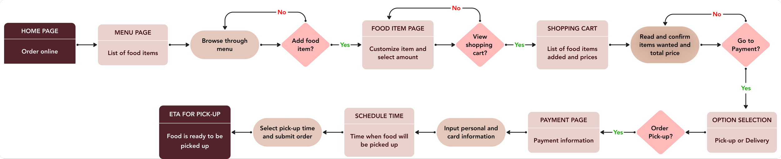
With the flow clearly outlined, I gained a clearer vision of the user journey for those opting to pick up food on their way home. I iterated on this flow, brainstorming ways to streamline the process and minimize unnecessary steps. I aimed to alleviate the burden on the already busy lives of college students, working professionals, and anyone else who might resonate with this experience.
Referring back to this flowchart proved invaluable in ensuring alignment with the primary flow. It served as a reliable guide, helping me maintain consistency and coherence throughout the process.
Upon completion, I felt ready to take the next step.
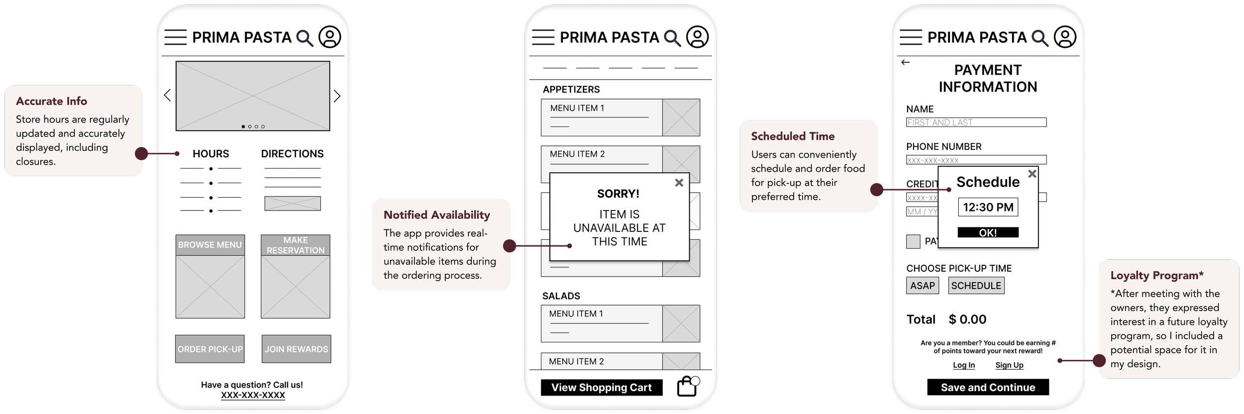
SKETCHES
Drawing Out the Initial Sketches
Designing multiple iterations of each page allowed for a thorough exploration of design options. This approach encouraged me to test out possible user pain points, ensuring that the final digital wireframes would effectively address user needs.
Keeping our target users in mind, I prioritized providing both accurate restaurant information and easy access to begin an order on the home screen.


Wireframe sketches of the home page (left) and other pages of the user flow (right)
WIREFRAMES
I addressed key pain points by strategically placing restaurant information on the homepage, implementing a notification pop-up for unavailable items, and allowing users to easily choose their preferred pickup times.
MID-FI PROTOTYPE
Turning Paper Sketches Into Digital Wireframes
I turned my sketches into mid-fidelity wireframes and made sure to prioritize incorporating user feedback and research findings into each screen to ensure that the final product would be tailored to meet the needs of the target users.
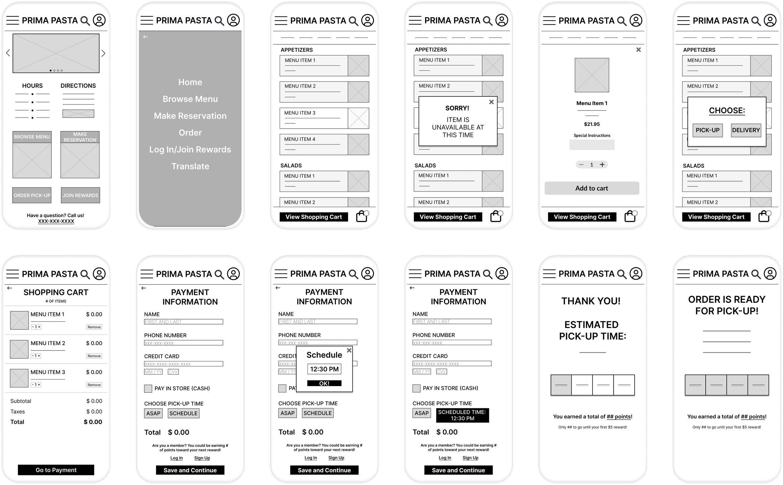
Creating My First Prototype
Using these wireframes, I created a mid-fidelity prototype to test the usability of the primary flow of ordering items from the menu for pick-up at a scheduled time.
I was eager to gather feedback and insights from potential users!

USABILITY TEST
Testing My Mid-Fi Prototype
I conducted usability testing with 6 participants, each lasting about 15 minutes.
I chose to do a moderated usability study to capture participants’ thoughts, emotions, and impressions in the moment, leading to more accurate and nuanced feedback. I also wanted to be there to provide guidance and support, if needed, to participants to help reduce any potential anxiety or confusion.
The objectives of the test were:
Observe if users can accomplish the specified task. If they make a mistake, can they recover?
Identify areas of the app that require modification to improve user performance and satisfaction. Do any features consistently confuse or frustrate users?
This first usability test provided valuable insights and helped me understand any challenges users encountered while performing essential tasks on the app.
ITERATIONS
Refining My Design Based on User Feedback
Feedback from the usability test helped define pain points users experienced while testing my design and guided significant iterations.
I learned that some buttons, icons, and wordings were causing users to be confused and frustrated. I used these pain points to refine my design to create an improved user experience.

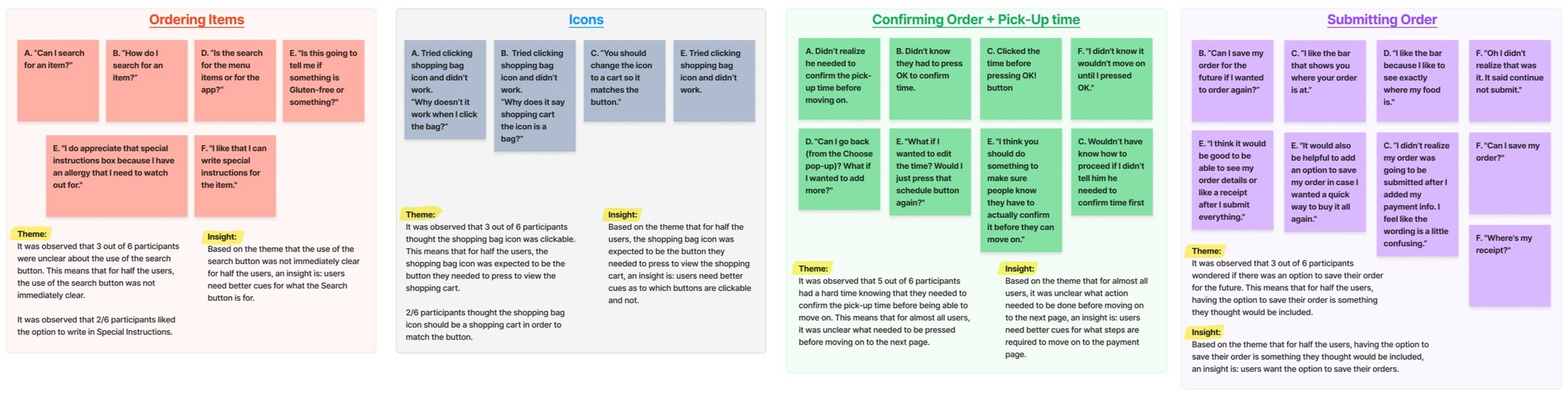
AFFINITY MAP
Organizing the Results
After analyzing the data I collected, I synthesized my findings into an affinity map to identify common themes and determine important insights.
This method facilitated a visual and systematic organization of my notes and observations, making it easy to synthesize user feedback, identify patterns, organize insights, and prioritize improvements.
USER TESTING
Determining If Users Can Navigate the App
After making these key iterations, I created a hi-fi prototype to conduct a second usability test.
Results from this test helped me identify more areas of improvement and with the provided feedback, I created revisions to fill the gap between my understanding of the users and what the users experienced.

The test also showed that users were able to successfully complete the process for order for pick-up and expressed positive reactions:

More importantly, I found that out of all users:

HI-FI PROTOTYPE
The Refined, Final Hi-Fi Prototype
The final hi-fidelity prototype addressed user needs for a streamlined process of ordering food to pick-up with enhanced visual elements.
I made sure to address the needs of our user archetypes:
I met busy college students’ need for quick and accurate food orders by providing updated hours and item availability upfront.
This app meets working professionals' need for convenient order tracking with a visual meter that shows real-time status updates, ensuring they know when to pick up their orders.


ACCESSIBILITY
Designing With Accessibility and Inclusiveness In Mind
Inclusive design and accessibility were priorities throughout my design process, as it ensures that all users can access and benefit from the app’s features. I made sure to consider the needs of users with different abilities, backgrounds, and preferences to create an app that is user-friendly and accessible to everyone.

NEXT STEPS
Tracking Improvements Using Metrics
Unfortunately, outside circumstances delayed the owners from securing a developer to bring my designs to life, so I was unable to track and analyze the effectiveness of my designs after development.
Nevertheless, I identified key metrics I would have used to gauge app performance, pinpoint areas for improvement, and drive data-driven decisions for further enhancing the user experience for Prima Pasta's customers.
To gain these actionable insights, I would monitor key metrics such as:

What I Would Do Differently
While the Prima Pasta app garnered generally positive feedback from user testing, I noted a couple of areas where improvements could be made.
I observed inconsistencies in my use of terms like 'carry-out,' 'take-out,' and 'pick-up' throughout the testing and initial design phases.
Such inconsistencies risk confusing users and causing errors, highlighting the necessity of clear language for seamless communication and navigation.
In hindsight, I should have prioritized maintaining consistent terminology and actively sought user input to refine language choices, ultimately enhancing communication, boosting user confidence, and driving engagement within the app.
In my efforts to streamline the ordering process for pick-up, I had inadvertently neglected to add a section on the home page for the option to ‘Order for Delivery’.
Excluding a delivery option on the home page may lead users to overlook its availability, potentially leading to lost business, as users seeking delivery might leave the site assuming it's not offered. Highlighting the delivery option on the first page users see enhances user experience and encourages its use.
Unfortunately, I incorporated this option towards the end of the checkout process. Although not necessarily harmful, I recognize that conducting additional research could have identified the optimal placement and potential impact on the delivery ordering process.
What I Learned
This project was a valuable learning experience for me and was a great example of the importance and incredible usefulness of conducting user testing and gathering feedback.
Through the iterative design cycle, I observed firsthand how the insights gathered from users shed light on pain points and opportunities I might have otherwise missed. This not only deepened my appreciation for the nuanced needs of our target users but also taught me the art of active listening – a cornerstone of effective design.
While designing this app, I confronted the challenge of maintaining a fresh perspective. It became evident that sustained exposure to my designs could lead to familiarity bias, potentially blinding me to potential pitfalls. This was a reminder that design isn't just about aesthetics; it's about creating an intuitive and seamless interaction. Regular user testing helped me regain objectivity and guided me in refining my prototypes to elevate the user experience.
As I reflect on the lessons learned and the progress I made, I'm reminded that every design challenge is an opportunity to learn, adapt, and refine my skills. This case study stands as a testament to the power of user feedback, iterative design, and the ever-present need to innovate.
Thank you for taking the time to read through my case study!